Back in 2008, The New York Times published a map showing the shift in presidential voting from the previous election. It’s not a map of the actual vote that year. Instead it shows whether the vote in each county was proportionally more for the Republican candidate or more for the Democratic candidate than four years earlier.
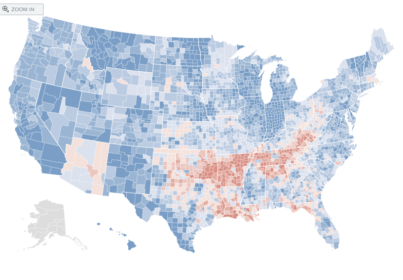
The map showed most of the country shifting votes toward the 2008 Democratic presidential candidate, Barack Obama, compared with the 2004 election (blue counties). The rock-ribbed Appalachia region of West Virginia, Kentucky and Tennessee and then what seemed like the whole states of Arkansas and Oklahoma liked John McCain even more than they liked George W. Bush (red counties).
The question from friends outside Arkansas to me was pretty simple: Are Arkansans racist? Is that why the state voted in even higher percentages for McCain than for Bush? Was a larger proportion of the state latently bigoted toward an African American candidate named Barack Obama? Two years earlier, the same electorate had easily voted for a white Democratic governor.
I didn’t have an easy answer. I live in the cocoon of a college town in a relatively progressive section of Northwest Arkansas. At that time, my county’s administrative officers were mostly Democrats, although the county’s board of representatives, called a Quorum Court in Arkansas, had been shifting toward Republican for nearly a decade.
But the rest of the state? I knew that Arkansas voters, like voters in my county, had begun voting more and more Republican, in general. I had little sense about how people felt about race in the rest of the state, whether it played a role in their vote that year, or whether the shift indicated more fully the broader shift toward Republicans.
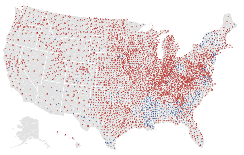
Part of that was answered in 2012. The New York Times had a variation on their voting shift map, using arrows to show the shift. It showed that Mitt Romney got a better share of votes than had John McCain across nearly all of the country. If one is a contrarian like me, one is tempted to ask if such liberal states as New York and Massachusetts (and every state in the upper Midwest and west of the Mississippi River) are racist, based on these results.
I don’t think they are any more or less racist than other parts of the country, including Arkansas. I think, instead, you see that shifts can be unrelated to racial animus. The 2008-to-2012 shift probably happened because Obama had done so well in 2008 that he couldn’t shift a higher percentage of voters his way in 2012. Obama still won, but by a smaller margin across most of the country.
This year, I put together a Google map showing Arkansas’s shift by county from the 2012 presidential election to the recent 2016 election. It shows perhaps an even stronger shift toward the Republican presidential candidate in 2016, except for the counties with the highest population: Benton, Washington and Pulaski counties, where the shift was toward Democratic candidate Hillary Clinton.
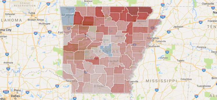
Data per each county is added, including the point shift in the percent between the two candidates as well as the actual votes in 2012 and 2016.
